
So as of April 17th, The White Buffalo released an incredible album of songs on the Spinefarm label titled ‘On The Widow’s Walk’. The album is distinctly split into two parts, and it juxtaposes so many different emotions, sometimes in the same song.
Obviously, such a delightfully complex album requires artwork that reflects the plethora of moods and emotion that permeate the album’s run-time.
If you read the first part of this short series, then you’ll know in April 2018, I presented Jake (aka The White Buffalo) with a portrait I had made, referencing a photo taken the year before taken by a great friend of mine, Rob Blackham.
I woke up on a cold Friday morning in November 2019, about to leave for an appointment when I decided to check my email real quick.
There, at the top of the inbox list, was a message from a name I didn’t recognise. I clicked on it, and I read on.
It was a message from Jake’s team, telling me that Jake was going to release a new album in the spring, and that because of my previous portrait, my name had come up a few times.
I was in shock, if I’m honest, but agreed on a conference call to California later that day.
In that call (which was over a seven hour time difference), I was given a brief, including the album name and the idea of stormy water – and lots of it!
On my long journeys to my university studio that week, I sketched voraciously, and then brainstormed the rest of the time.
Finally, I settled on an image, of Jake as a front-facing, prominent subject and a background of a tempestuous sea and a dark sky. It would be dramatic, but it would also be serene, which would perfectly reflect the tone of the album itself.
This idea was green-lit on the next conference call, and on returning to my university studio, I got to work.
The Support
I began by deciding on the dimensions, and this would be a square canvas given that the painting would eventually adorn the front of a record! I cut the timber for the 900mmx900mm stretcher, and reinforced it as…well…it’s massive!
I decided on a medium-fine duck linen canvas, and I stretched it over the timber frame, by hand (and my knuckles bled a hell of a lot). It’s a time-proven process, and was taught to me by a friend. I secured the canvas with staples and pins, and then primed it with a white gesso. This effectively means there is a barrier between the delicate canvas and the heavy oil paint and the subsequent mediums I would be using. Without this, over time, the oil would soak into the canvas, and the painting would appear patchy and discoloured.
The Preparation
I hung the canvas up on one studio wall, and on the other, I pasted my inspiration and ideas for this piece. Among these ideas were the resurgent Pre-Raphaelite painters, as well as other album works, and my love of Western Art.
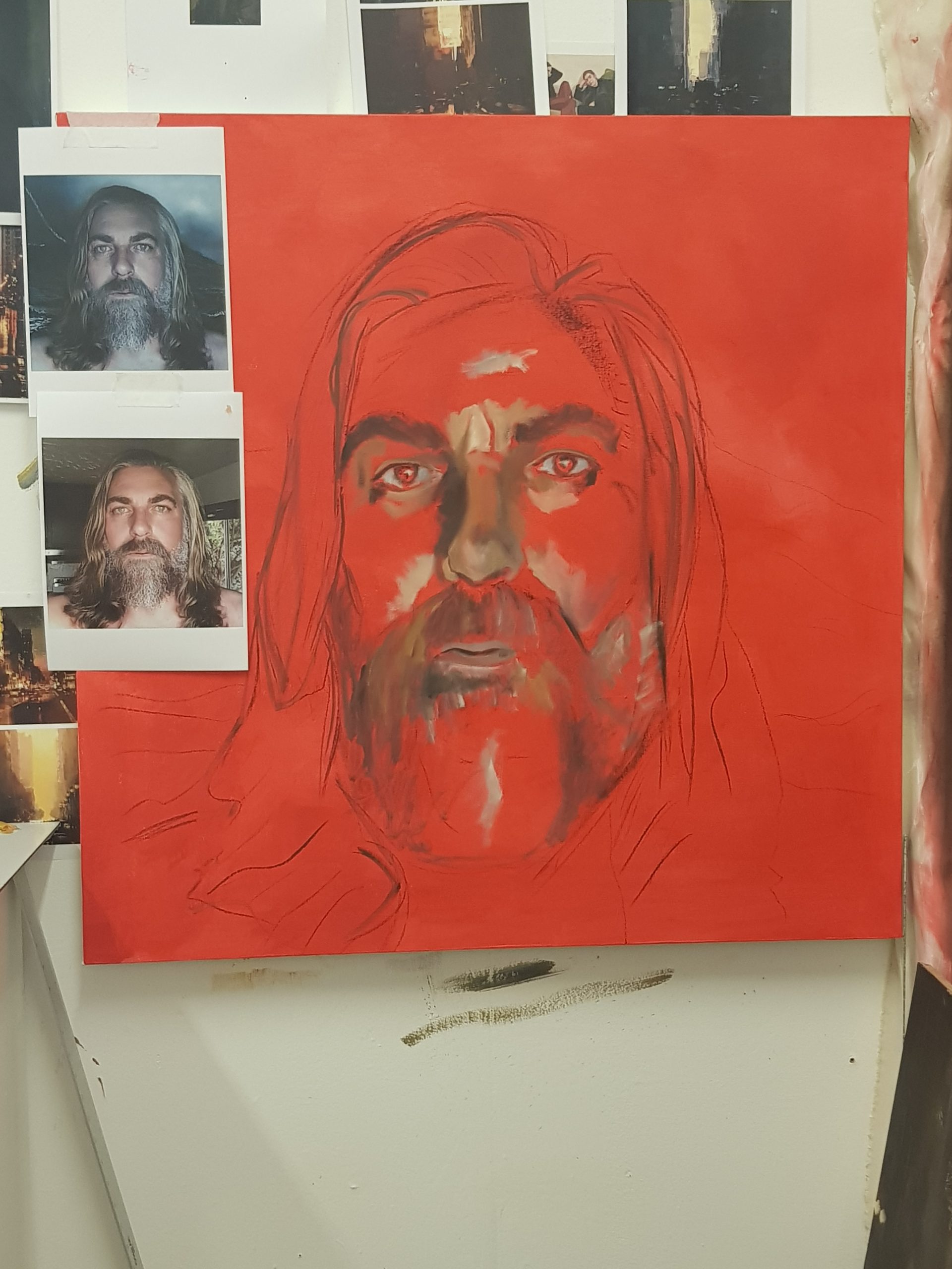
I projected the photoshopped mock-up of the composition onto a now red-primed canvas. Why red? Well under your skin is blood, and so painting skin-tones onto a red ground means it will always be tinged by that carmine colour.
Upon the projection, I used a stick of charcoal to plot in the largest shapes and forms of the waves and the subject’s face.
The Painting
The first pass of painting is to be loose and relatively un-detailed. Here, I just plotted in the highlights of the face, and the darkest recesses of it also. I created a very, very thin wash of Cobalt Blue and Raw Umber, which I then splashed across the seascape. This would ensure that my values (how light or dark the tones I paint are) would be in context, and fit the final work.
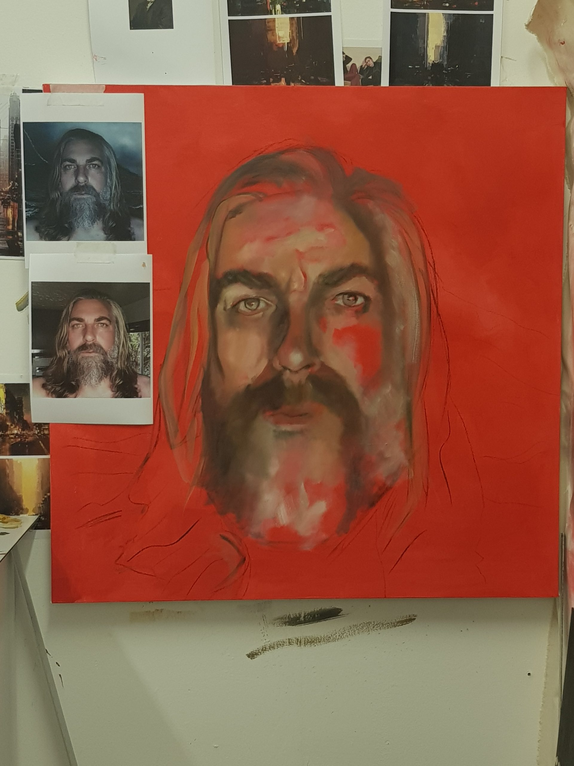
Once dry, the second pass begins to add the more contextual forms of the face; that is to say, I sculpt in the brow and the orbital shapes around the eye.
The third pass is the time for real detail, like the eye, and on Jake – the hair and the beard! I wanted these to be prominent, as they allow an artist great creativity in how to portray it (also, because Jake’s beard has a fanbase of it’s own now!)
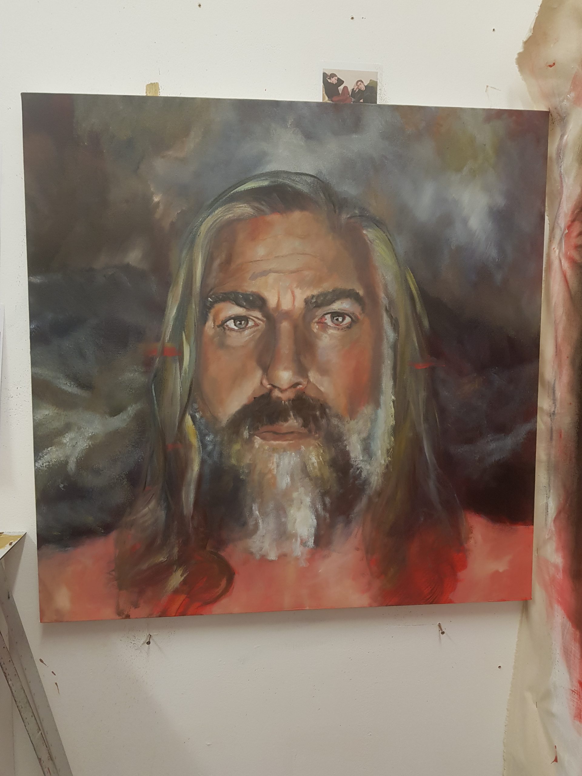
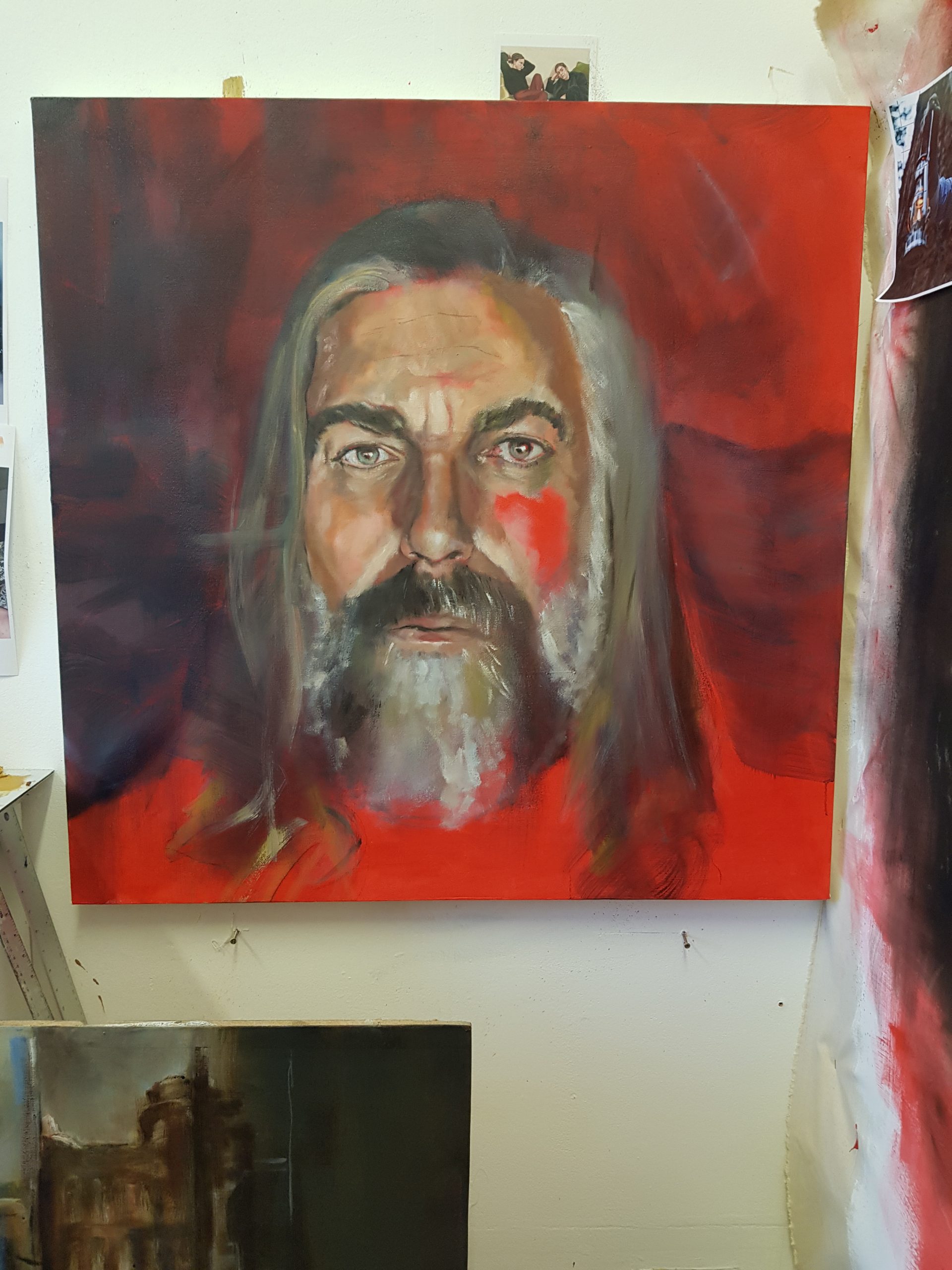
I added detail using palette knives, squeegees, wire wool, normal bristle brushes, and sandpaper, and I took these very gestural ways of applying paint into my painting of the sea behind the subject. This would suggest chaotic movement, all the while contrasting the assumed serenity of Jake’s expression.
All the while, I was checking back in with Jake and his team, putting our heads together and agreeing on what should stay, and figuring out how we would correct that which should not.
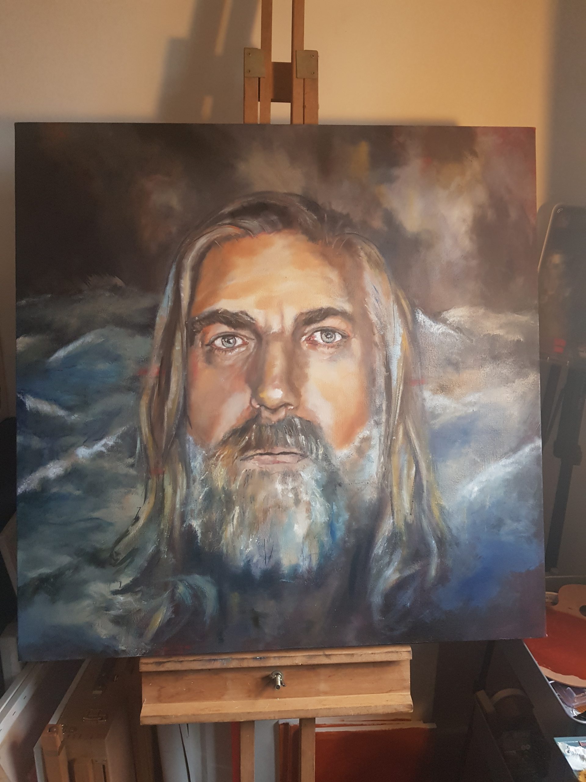
By late January, the painting was complete, and had travelled with me on four different modes of public transport back to my home studio…in rush hour…with cranky Londoners finishing work. I counted three instances of a heel nearly crashing through the painting, two instances of the still-sticky oil painting ruining a commuter’s jacket, and an incalculable number of curse words from me and my fellow passengers alike!
But finally, it was ready. I called on another great friend and photographer, Jon ‘Kempy’ Kemp, and we created a hi-res image of the work, which was fired over the web to Los Angeles, California. The first time I saw the finished image with the text added was when it was announced worldwide, and that was pretty special.